


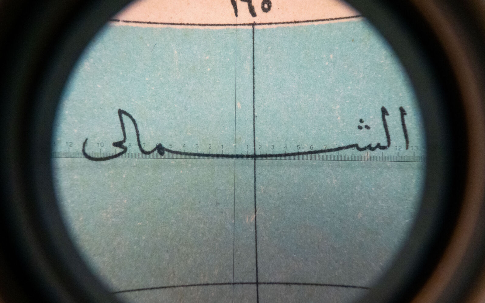
If you work with Latin script, justification means adding space between words. In Arabic, we do something different; we stretch the word itself, from the inside. This technique is called Kashida, and it has its own history, its own rules, and its own beauty.
Since I moved to the UK I see Arabic typography everywhere. On multilingual signs, public documents, product labels. And sometimes I see it used in ways that do not feel quite right. Arabic squeezed into a space it was not designed for, stretched without understanding, justified without care.
In this talk I will show you where Kashida can go and where it cannot, and how many you can fit in a single word. We will look at how calligraphers used it to label rivers on maps, how engineers tried to automate it in the 1960s, and what it means for brand design, motion typography, and variable fonts today.
I hope by the end you feel more confident with Arabic typography and maybe a little in love with it too.

Partners

graphic District Partner

graphic District Partner
