The TypoCircle presents Typographic Truthiness
Words have power. But the way in which those words are presented has more power than you might expect. Can a choice of typeface turn fiction into fact, influence an emotion, or revive a brand?
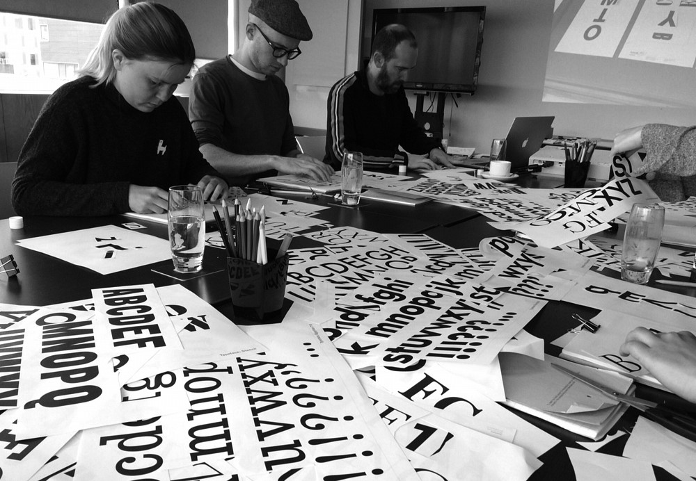
The TypoCircle presents 'Typographic Truthiness', a workshop led by advertising creative director and designer, Louise Sloper, alongside Studio Sutherl&’s founder, Jim Sutherland. We will explore the psychological powers of typographic persuasion in advertising, with playful, hands-on exercises based around the eye-opening Errol Morris/New York Times typeface experiment. Can one particular typeface command more gravitas than another? Comic Sans vs Baskerville… bring it on!
Expect paper, scissors, glue and pens – with lots of example projects and case studies thrown in to get you inspired. All analogue, no computers. See you there.


Partners
graphic District Partner
