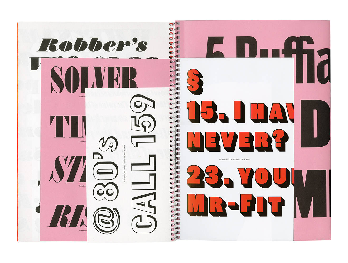
For nearly ten years Commercial Type have been producing new typefaces for todays needs and challenges; from such classics as Guardian, Publico and Graphik through to new and challenging faces like Orientation, Marian and Dala Floda. But another side to Commercial Type, Commercial Classics, has been looking to the past, and finding old forms that modern designers will find useful, from large serif and sans families like Brunel and Caslon Doric, through to more unusual but beautiful styles, like the strange Caslon Italian. Commercial Type partner Paul Barnes will be talking about where these old faces come from and how they have been remade for today.
Speakers

Paul Barnes
Partner at Commercial Type
Paul Barnes is a type and graphic designer, and a partner in Commercial Type, a leading Anglo-American type foundry. With his partner Christian Schwartz he designed the famed typefaces for the Guardian newspaper in 2005 and recently revisited them for the 2018 redesign. He has designed typefaces for a wide range of clients, from the National Trust to the numbers on Puma and Umbro Football shirts. His retail typefaces include Publico (with Christian Schwartz), Dala Floda and Austin. Commercial Type have recently launched a second venture Commercial Classics, releasing new versions of classic typefaces.


